
Print Placement Matters: Why Design Composition Is Everything on Shoes
Most prints fail not because of the art but because of where the art lands. Shoes bend. Shoes crease. Shoes move. Composition decides whether a design reads as intentional or chaotic. The right placement turns a good print into a pair you reach for every week.
Why placement matters
Shoes are read at a glance and from the ground up. The eye catches the side panel first, then the toe, then the lace area. Seams and curves cut through art. Good composition respects the anatomy so the design stays legible in motion and in photos.
Know the canvas
-

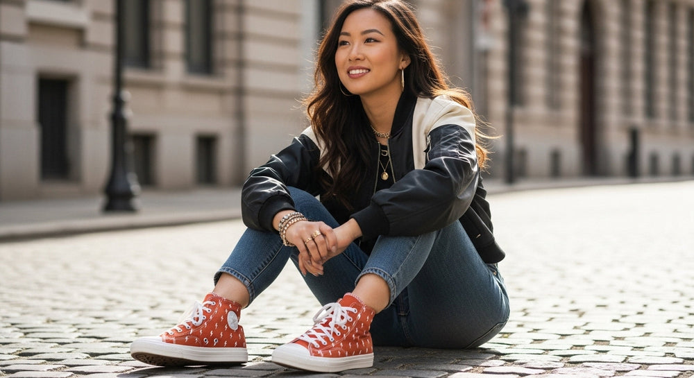
Basic shoe anatomy for print placement.
- Vamp The toe and front of the shoe.
- Quarter The main side panel.
- Heel counter The back panel that stabilizes the heel.
- Eyestay The reinforced lace channel.
- Tongue The padded flap under the laces.
- Foxing The rubber band framing the upper.
- Outsole The ground-contact layer of the sole.
Guiding principles of composition
- Scale Big motifs feel bold on quarters. Micro prints feel refined anywhere.
- Focal point Give the eye one clear place to land on each side.
- Balance Pair one active area with one calm area so the shoe can breathe.
- Seam awareness Do not run a face, flower center, or medallion through a seam or heavy curve.
- Motion Place detail where the shoe flexes the least so it does not distort.
- Distance test The design should read at ten feet as a shape and at two feet as detail.
- Color discipline Use a leading color and one or two supporting colors so the print does the talking.
Placement by silhouette
Low top
Quarters do the heavy lifting. Keep the vamp calmer unless the print is micro.
High top
You gain vertical canvas. Consider a hero motif high on the collar and a quieter vamp.
Slip on
You get a large uninterrupted vamp. Allover repeats and centered motifs both work.
Platform
Visual weight sits lower. Use slightly larger prints so the upper does not look top heavy.
Placement by print type
Animal textures
Treat animal prints as textured neutrals. Hero the quarter. Keep the vamp solid or micro textured.
Scale is everything. Large patches read graphic. Smaller patches read polished. Avoid slicing patches across seams.
Checks and checkerboard
Use the quarter for the grid. Calm the vamp and heel so lines stay crisp.
Florals
Two paths. Fine single ink botanicals for minimal looks. Painterly petals for statement pairs. Keep the blossom center clear of seams.
Ornate vintage motifs
Toile and filigree reward restraint. Use border framing along the eyestay or foxing and a single medallion on the quarter.
Geometric color blocks
Hard edges belong on straighter zones. Let one color lead and the others support.
Three proven layouts
The hero quarter
One strong motif or repeat on the quarter. Quiet vamp. Clean heel. This reads premium and is easy to style.
The border frame
Fine linework or filigree along the eyestay or foxing with a small emblem on the quarter. Elegant and wearable.
The checker and calm vamp
Checkerboard or tartan on the quarters with a solid vamp and heel to avoid line breaks. Classic and crisp.
Common mistakes
- Printing a face or flower center across a seam.
- Equal activity everywhere so nothing stands out.
- High contrast on the vamp that creases and scuffs first.
- Too many colors fighting the print.
- Ignoring left and right as a pair.
Designing the pair
Mirror or complement
Mirroring gives symmetry. Complementing gives story. A single flower on the left and a leaf on the right.
Left and right flow
Keep visual weight similar so one shoe does not overpower the other.
Subtle asymmetry
Shift a motif a little on one side so the pair feels alive without looking mismatched.
Choose placement by style goal
- Quiet strength Tonal snakeskin on quarters with a solid vamp and heel.
- Graphic statement Zebra or cow at a bold scale on quarters with minimal trims and laces.
- Heritage ease Tartan on quarters with a solid vamp and a single accent line on the foxing.
- Romantic art Fine botanical or toile linework with a single medallion on the outer quarter.
- Creative color Primary color blocks with one lead color and two support colors.
Pro tips for custom work
- Mockups Test two scales and two placements before you print.
- Safe areas Leave a buffer around heavy curves and high flex zones.
- Negative space Treat empty canvas as a design choice. It is where the eye rests.
- Durability Mid contrast palettes hide scuffs. Busy vamps show wear sooner.
- Photography Shoot side profiles first. If the side reads well the rest will follow.
FAQs
Which areas take prints the best
The quarter and heel counter are the safest zones. They flex less and frame art cleanly.
Can I mix two prints on one pair
Yes. Share one color across both prints. Pair a small gingham with a single floral emblem or a quiet snakeskin with a bold zebra panel.
How big should a motif be on a size eight
A single hero motif usually works best at three to four inches wide on the quarter. Scale up or down about ten percent per full size.
[Add product link: Checkerboard customs]
[Add product link: Tartan and plaid customs]
[Add product link: Floral collection]
[Add product link: Ornate vintage motifs]
[Add product link: Animal print collection]
[Add product link: Zebra print canvas shoes]
[Add product link: Shop all customs]
Leave a Comment