
Canvas Isn’t Just a Fabric > It’s a Medium
Canvas is not background. It is the stage, the frame, and half the story. Treat it like a medium and your shoes stop being products and start being portable art.
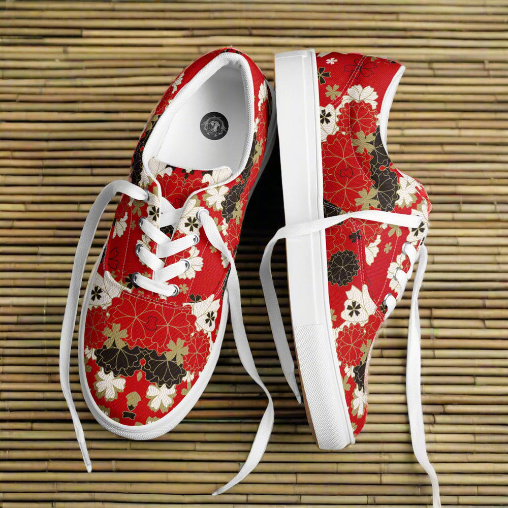
What canvas does for design
- Holds line fibers grip ink so edges look crisp on curves and seams.
- Balances color the natural matte knocks down glare, so bold colors read rich without looking plastic.
- Welcomes texture snakeskin, toile, and fine botanicals gain depth because the weave adds quiet grain.
- Scales well micro prints stay legible, hero motifs keep their shape, and both photograph cleanly.
The visual language of canvas
- Line use clean outlines for borders and emblems. Canvas rewards decisive strokes.
- Shape commit to clear silhouettes. The quarter is your widest field; the heel counter is your exclamation point.
- Negative space leave calm zones on the vamp and heel so the eye can rest and the print can breathe.
Tech that respects the medium
Direct print on canvas panels
Best all round choice for gradients, snakeskin, and painterly blooms. Color sits close to the fiber, keeping detail sharp.
Dye sublimation on poly canvas
Ink bonds to the yarns, yielding durable color with a soft hand. Ideal for allover repeats and disciplined checker grids.
Screen print for single color strength
Opaque inks lay clean, perfect for borders, monograms, and engineered linework along the eyestay and foxing.
Embroidery and patches
Thread adds relief without fighting the canvas texture. Keep stitch density moderate so the upper stays flexible.
Placement that turns canvas into a gallery
- Quarter as canvas this is the main field. One focal point per side is the rule.
- Eyestay as frame run fine filigree or stripes to guide the eye without stealing focus.
- Foxing as border a clean band acts like a mat around the art. Keep it neutral or echo one lead color.
- Heel counter as signature reserve it for dates, initials, or a small emblem.
Color on canvas
- Tonal sets stone, sand, espresso, charcoal. Depth without noise.
- Primary focus one bold red, blue, or yellow with quiet allies. Modern, graphic, wearable.
- Soft contrast cream with olive or clay with black. Ages well and hides scuffs.
Motion and longevity
- Design for flex save micro detail for zones that move less. The vamp will crease first.
- Edge clarity align grids to seams so lines stay true as the shoe bends.
- Care simple mild soap, soft brush, air dry. Keep the foxing clean and the whole upper reads fresh.
Story forms made for canvas
- Diptych pairs left and right tell one story across two panels.
- Border tales a continuous line wraps the eyestay and ends in a small emblem.
- Edition runs small numbered batches with a single palette shift or scale change.
Quick choosers
- I want subtle texture tonal snakeskin on quarters and a calm vamp.
- I want graphic structure checkerboard or tartan on side panels with neutral trims.
- I want art forward toile border plus a single medallion on the outer quarter.
FAQs
Why canvas over other uppers
It holds line, softens glare, and makes prints feel like art, not decals. It also breaks in comfortably without losing the design.
Will bold color crack
Not when placed on panels that flex less and printed with the right method. Keep the vamp calmer for best results.
How do I keep canvas looking new
Spot clean, rotate wear, and refresh laces. A clean foxing band resets the visual read.
Leave a Comment