
How to Spot a Fad vs. a Foundation in Footwear Trends
Some trends spike and fade. Others become part of how people dress for years. This guide gives you simple tests to separate a short term fad from a long term foundation in custom footwear so you can design pairs that sell and keep getting worn.
The foundation test in one line
A foundation works across outfits, seasons, and silhouettes with minimal compromise. A fad needs very specific styling, timing, or hype to make sense.
The 7 signal tests
1. Wearability across three outfits
Place the concept next to three looks you wear or sell often. If the shoe works with two of the three, it passes. If it needs a new outfit to make sense, it leans fad.
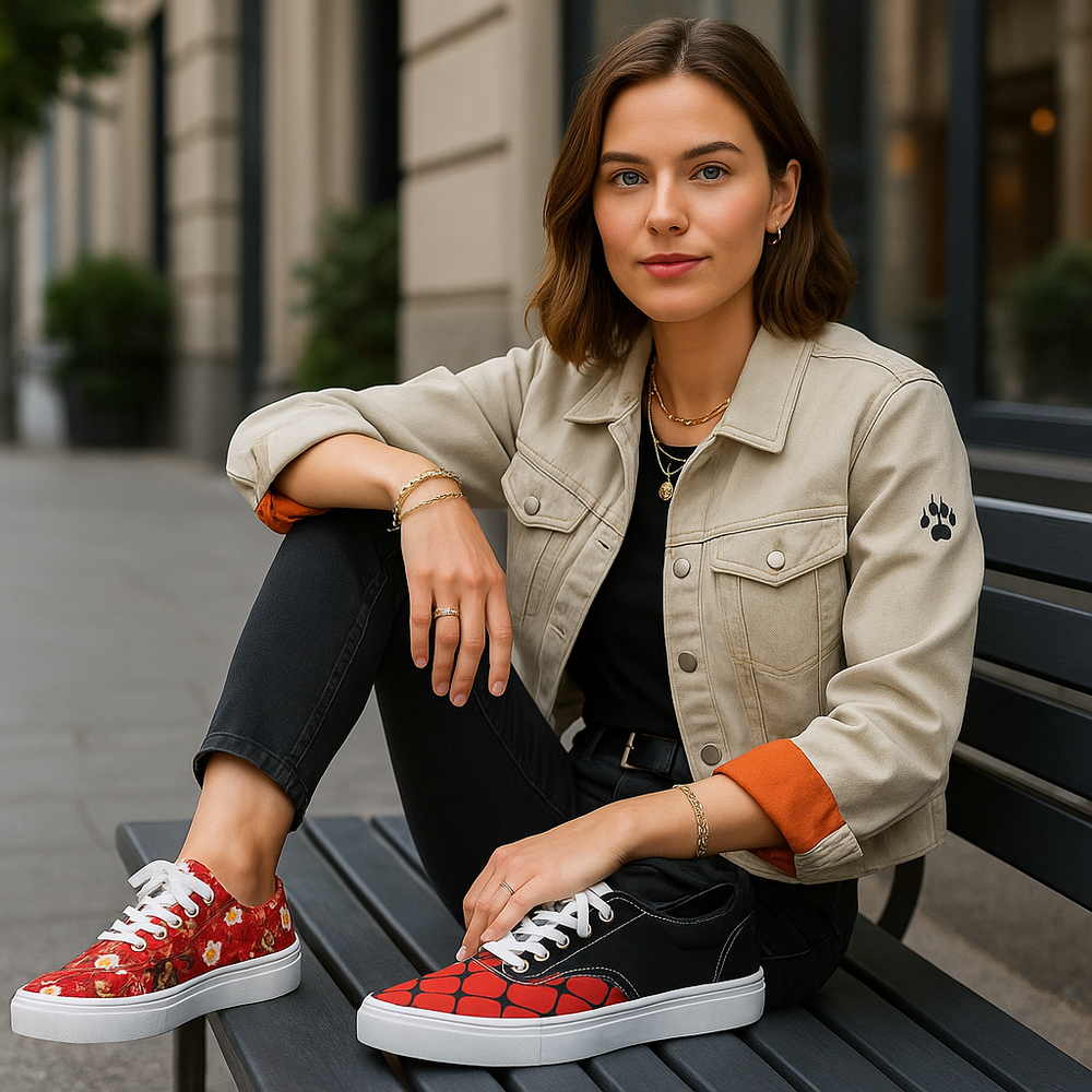
- Pass example tonal snakeskin quarters with neutral trims match denim, tailoring, and tees.
- Fail example a high contrast novelty print that clashes with most closets.
2. Palette discipline
Foundations use a tight palette. One lead color with one or two support shades. Fads often need many colors to read.
- Pass cream and black checker on quarters with a calm vamp.
- Fail five colors competing for attention on the vamp and heel.
3. Placement that respects the shoe
Foundations stay legible in motion. They put detail on quarters and keep the vamp calmer. Fads often force key art across seams and heavy curves.
- Pass tartan or plaid on the side panels with solid toe and heel.
- Fail a face or emblem split by the vamp crease.
Plaid Customs
Print Placement Guide
4. Scale that survives distance
Foundations read at ten feet as shape and at two feet as detail. Fads may only work in close photos.
- Pass micro botanicals or finely spaced grids that do not blur from a distance.
- Fail tiny script and dense icons that merge into noise.
5. Silhouette flexibility
Can the idea work on low tops, high tops, and slip ons with minor tweaks. If yes, it leans foundation. If it needs one very specific silhouette, it leans fad.
- Pass zebra as a modern stripe on quarters across silhouettes.
- Fail a layout that only works on one size or one model.
6. Season stretch
Foundations style in at least two seasons. Fads require a narrow window.
- Pass tonal neutrals and structured grids that pair with layers or tees.
- Fail highly seasonal novelty themes with short shelf life.
7. Cost per wear logic
Ask a simple value question. Will the buyer reach for this pair weekly. A yes signals foundation. If the pair feels like a one event shoe, it leans fad.
Foundation print families
Textured neutrals
Snakeskin, muted weaves, micro pebbles. These act like texture, not loud pattern. Place on quarters. Keep trims tonal.
Structured grids
Checkerboard, gingham, softened plaid. Crisp lines with clear negative space. Keep the grid away from heavy flex zones.
Checkerboard Collection
Plaid Customs
Clean florals
Single ink botanicals and simple silhouettes. Use one focal bloom or a fine repeat. Avoid splitting centers across seams.
High impact prints with rules
Cow print
Bold and photo friendly. Scale is the lever. Use large patches for statements and small patches for a more polished read. Keep trims simple.
Ornate vintage motifs
Toile and filigree work as borders and small emblems. Use restraint. Frame the eyestay or foxing and place one medallion on the quarter.
Design checklist before you commit
- One focal point per side.
- Quarter carries the story. Vamp stays calmer.
- Lead color plus one or two supports.
- Passes the two of three outfit test.
- Works on at least two silhouettes in your line.
- Readable at ten feet and rewarding at two feet.
Assortment strategy
Use a simple 70 20 10 plan. Seventy percent foundation prints. Twenty percent flexible style builders. Ten percent high impact statements. Refresh color within foundation families to keep the line moving without chasing every spike.
Common traps and how to avoid them
- Too many colors reduce the palette so the print can breathe.
- All panels active pair one active zone with one calm zone.
- Seam collisions never run a motif center through a seam or heavy curve.
- Only looks good on screen print a sample or at least do a distance test on a true scale mockup.
Quick chooser
- I want safe daily wear tonal snakeskin or softened checker.
- I want edge that still styles zebra on quarters with neutral trims.
- I want one statement pair cow print at large scale on quarters and a calm vamp.
- I want elegant detail toile border and a single medallion on the side panel.
FAQs
How do I know a trend will last
It passes the outfit test, the placement test, and the palette test. It also works on more than one silhouette and across at least two seasons.
Is animal print a fad or a foundation
It depends on scale and color. Tonal snakeskin reads like a neutral texture and behaves like a foundation. High contrast zebra is stronger and works best with simple trims and outfits.
Can I turn a fad into a keeper
Yes. Reduce the color count, move the focal point to the quarters, and choose a calmer scale.
Leave a Comment